UX/UI enhancements: Ailo filters
Context
Since 2020, Ailo’s property manager portal has seen rapid growth in usage, and product breadth and depth. With the scaling some early designs started showing usability issues where users would get confused or wouldn’t know how to use some functionalities. One key examples is how filtering data works and is displayed to users. With more users, larger customers and more and more tables, data, properties and contacts that property managers need to deal with it became evident that we needed to review the design of our tables, but especially the filters.
The challenges
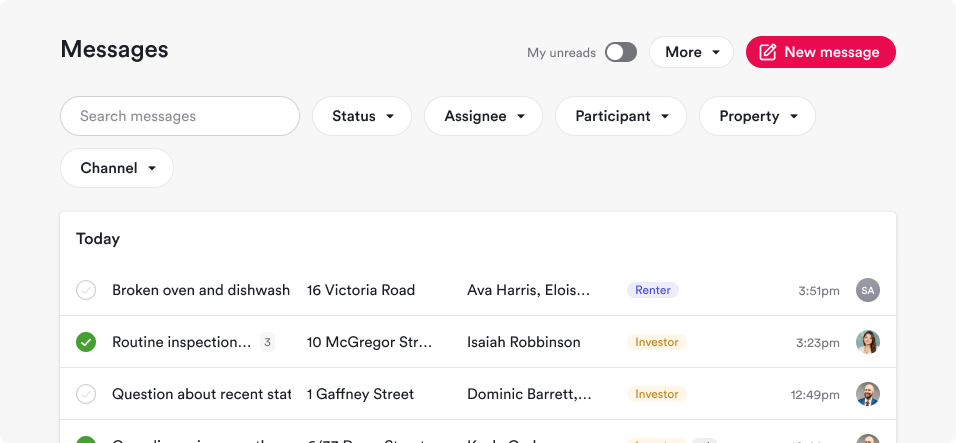
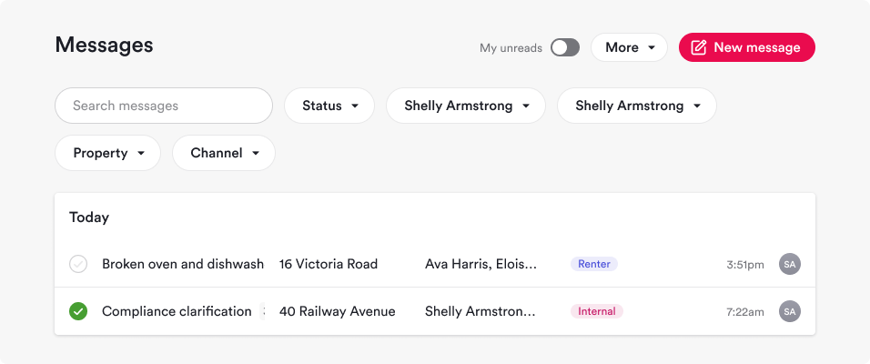
The existing filter in Ailo’s portal were large, easy to spot and to read the value the users were filtering by. Some problems surfaced when there were too many values selected, to many attributes to select, and results that were not meeting the expectation. Some issues were:
A filter being used looked the same as one that wasn’t active, helping to confuse users;
The number of filters started requiring more lines and real estate, the formatting of the filters also took excessive space;
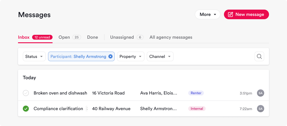
Values of an attribute (eg: Assignee: Shelly Armstrong) looked the same as values of a different attribute (eg: Participant: Shelly Armstrong)
How might we…
The solution required us to think through and design:
How might the user easily differentiate an attribute from the other when one or more values were selected;
How might a user easily understand which filters are impacting their results
How might we have a design that addresses the usability issues and at the same time mitigate the limited real estate without hiding key information
How might we design patterns that can be applied to very diverse information (Contact tables; Financial tables; Workflow tables; etc)
How might we ensure the consistency of design approach across all tables in platform?
Solution
The design solution required a few iterations between designers and the lead front-end engineer, as well as presentation to stakeholders and prioritisation against functionalities that the business want to build. Bringing up customer feedback collected by support, customer success team, and designers helped us push the implementation forward.
Solution details
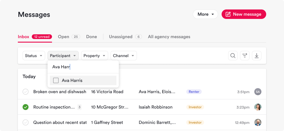
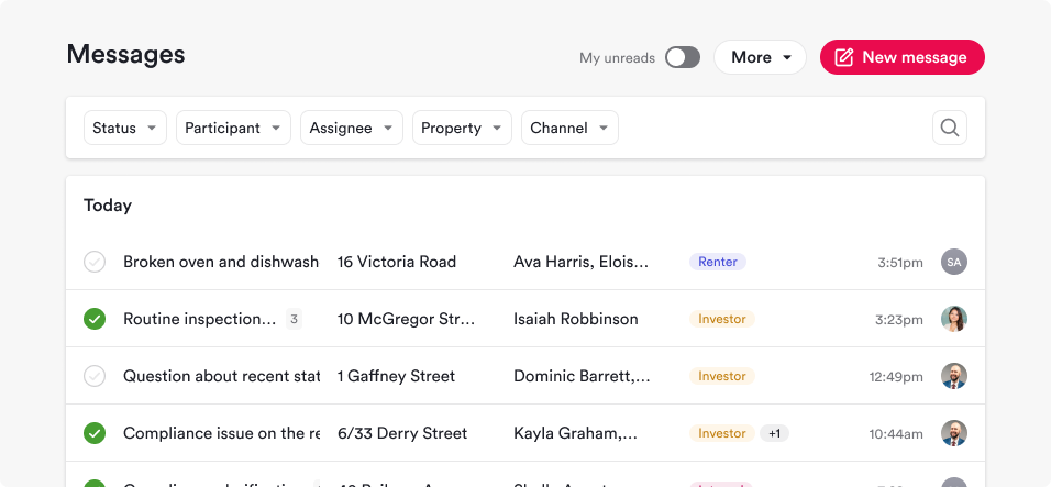
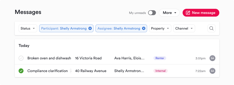
Eliminates the pill-form input that takes more real estate than square or rounded-corners input;
Reduces the size of the filters and font while still keeping the legible;
Keeps the attribute label visible instead of hiding them from the user once a filter is active;
Gives a clear visual indication of what filters are active using colour, weight and structure;
Gives the user a quick way to clear a filter if they’re not getting results;
Has been assessed against all table in the platform, as well as from the technical lenses on utilising the recently developed design system to implement it across the board.
Reception and further iterations
We had users proactively reaching out to feedback channels and via our customer success team complimenting Ailo for making the filters much easier to read, understand and use, proving the value of the redesign and the delight generated.
We also received feedback on ideas to improve the functionality even further by restructuring the messages based on different jobs to be done and simplifying the experience even further, as well as allowing users to save filter presets that we have designed and aim to build soon.